One of the wonderful things about raising kids is that you get to re-explore things you learned a long time ago and see these things through new eyes. In this case, as my daughter and I made the trek to piano lessons (hers not mine) we noticed a somewhat attractive new car pass by on an off ramp. Curious as to the brand I looked for the ever present manufacturer’s trunk badge.
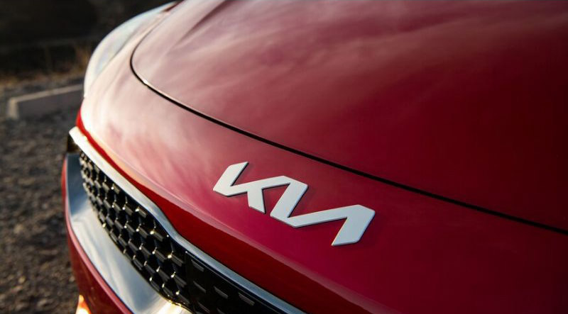
Now, my daughter is far less attentive to automotive brands than I and when I pointed out the nice looking car, she made her half hearted attempt to identify the company. Not being familiar with the new KIA logo, I too was a bit confused. Was that a “KN”? Maybe a “KVI”? I made the assumption through deductive reasoning that it was “KIA”. No one would create a new brand that’s so close to “KIA” were they not actually KIA, I figured. I wasn’t certain though.
Old says "fairly generic auto brand", new says "guess what letters"
An incredible light and fireworks show launched the new logo
Kia’s new logo represents the company’s commitment to becoming an icon for change and innovation
The Kia president’s quote above may hold true for their intent but a the end of the day, a logo needs to communicate a name or, at the very least not confuse the viewer as to what that name might actually be.
Kia’s goals are perfectly reasonable. As the President further stated… “The automotive industry is experiencing a period of rapid transformation, and Kia is proactively shaping and adapting to these changes. Our new logo represents our desire to inspire customers as their mobility needs evolve, and for our employees to rise to the challenges we face in a fast-changing industry.” Their automotive designs have accomplished this very well. I often admire the shape of newer Kia models.
Their logo sadly fails to meet it’s most basic function which is to communicate the company name. The old logo suffered from weak poorly designed letter forms and while the new logo is a nicer rendering, it leaves a reader confused as to exactly which letters forms they are supposed to be seeing. Is it an improvement? Yes. Is it a functioning, well designed logo? No.