The Emperor Has No Clothes!
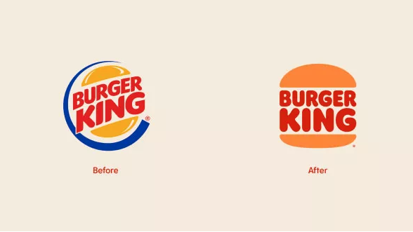
Burger King went through a re-brand way back in 1998. Over 20 years ago. Sadly dating myself, I recall this re-brand and wondered at the time why? Not so much because the brand didn’t need some sort of a re-fresh but rather, the new-at-the-time look didn’t really seem to make a whole lot of sense. An odd blue swoosh encircled the twisted “burger” icon. The bun became a shiny circle, the text, in bright red no longer gave the impression of the meat inside the bun. The colours, boy, aside from the addition of blue they sure did mimic “the other guys”.
With this in mind, a new-look BK has arrived! But it’s not new. I will be the first to applaud the return of the iconic burger logo.
A new-look BK has arrived! But it’s not new.
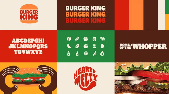
That Burger King has returned to their roots is not what concerns me. What surprises me is, after reading many reviews as well as all the praise for this new logo, I find the more design-focused the publication, the more likely the reviewer seems to ignore where this “new” logo came from. Designers have long looked to the past for inspiration for the future. “Every thing old is new again” as they say. In this case however, Burger King has literally returned to the old logo. Oh there is a “new” look to much of the surrounding graphics, the boxes, tray paper, burger wraps etc. which certainly has a modern-nostalgic appeal of its own. All well and good.


But lets not pretend the logo is anything but a return to a logo that probably should never have been dropped in the first place. At least not in favour of the shwooshy mess that they used through out the aughts.
To the agency responsible for this return to glory, I say “thanks”. I’d like to think this is BK’s return to more elegant design and moving forward, that the good folks at BK will remain a bit more loyal to said elegance.

