Under new ownership, Eco-Med Pharmaceutical was looking for a new up-to-date brand. Eco-Med's new owner wanted to capitalize on their Canadian roots as well as reflect a more environmentally friendly perspective.
The iconic Maple Leaf was added to contemporary green and purple colours with modern, warm and friendly fonts. Clean and simple.
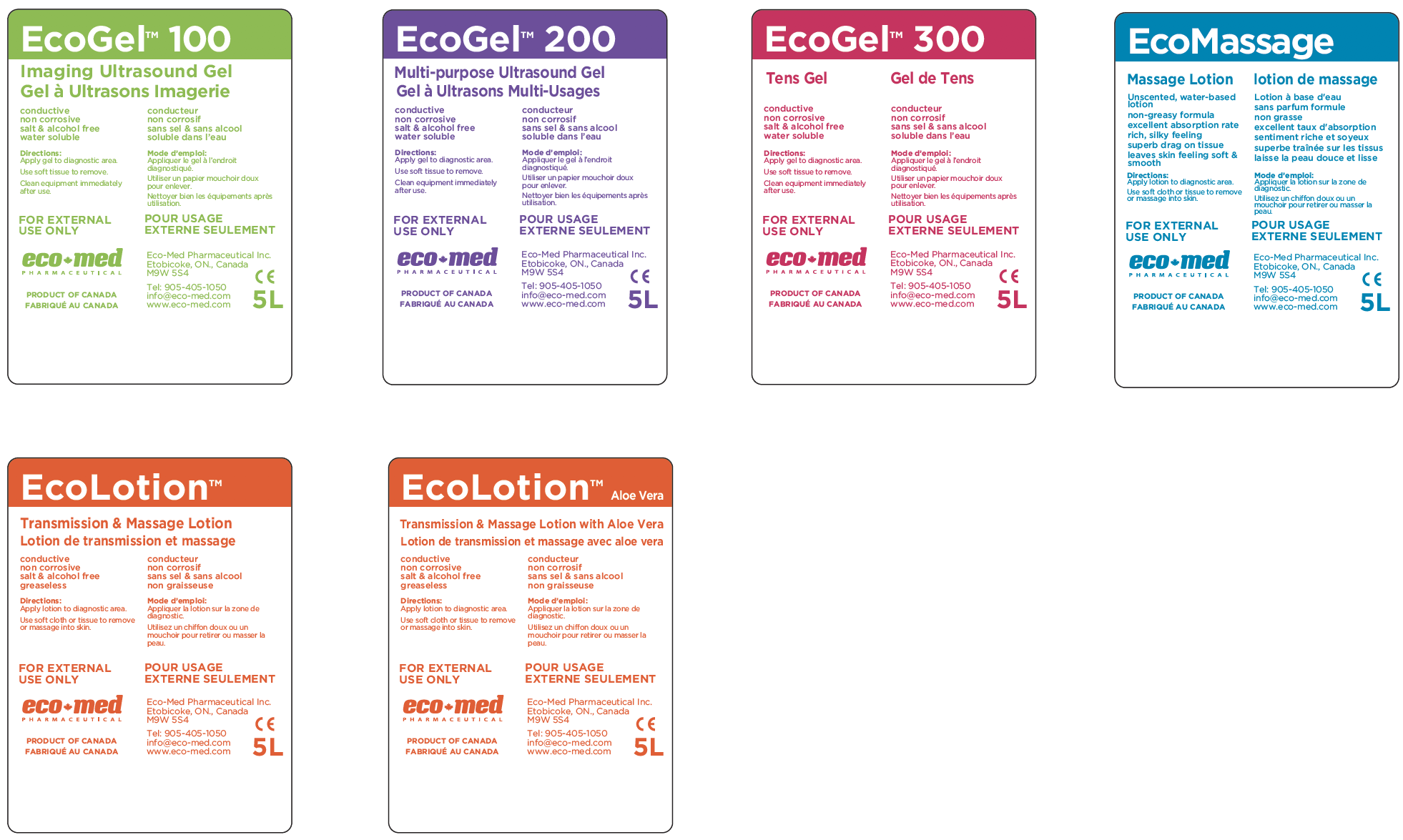
Carrying the clean and simple philosophy from the logo, labels were designed for each product using a simple single colour to represent each product.
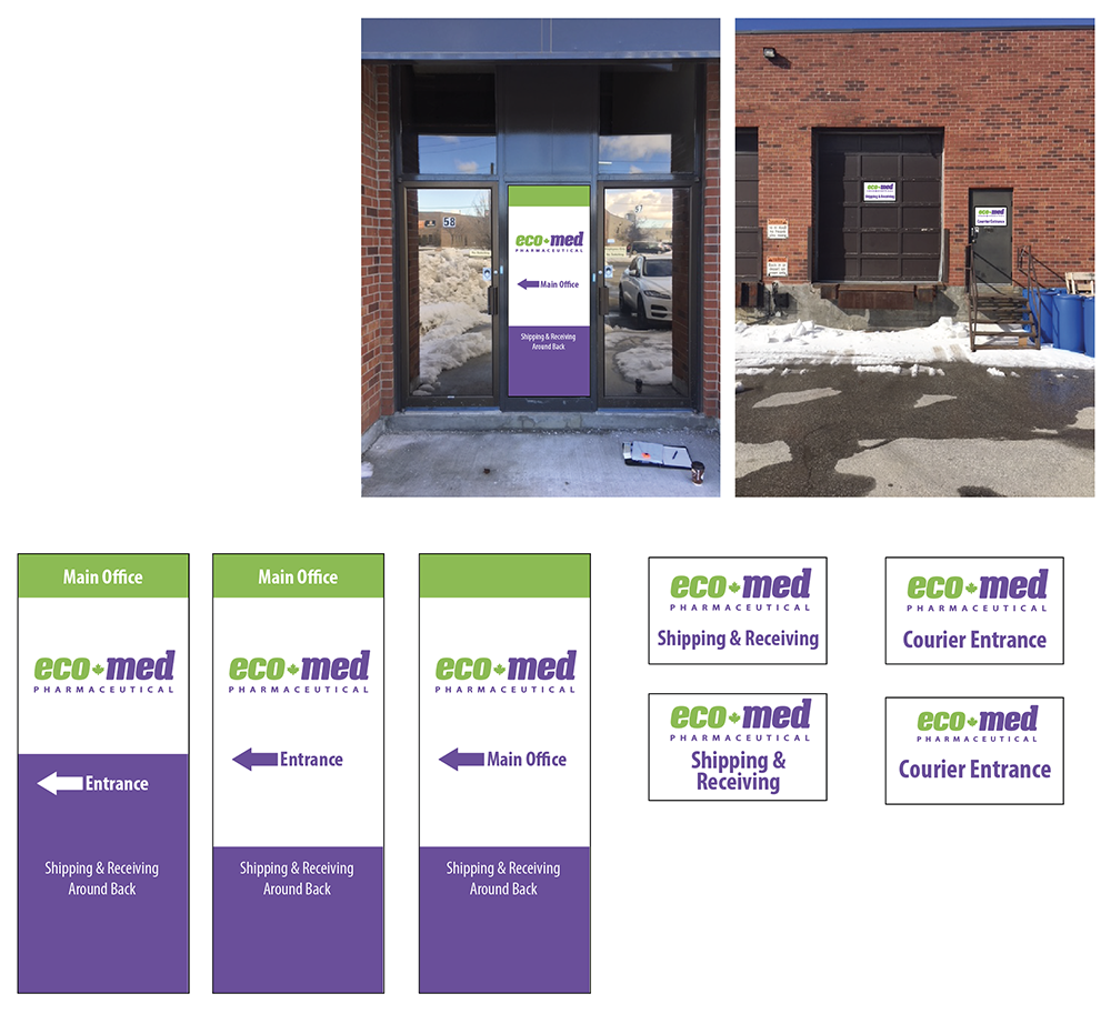
A feature wall welcomes people as they enter the head office and signage was also created to be used throughout the building.